More insights.

Subscribe to our newsletter.
Deep dives into design thinking, creative process, and the intersection of business and aesthetics.
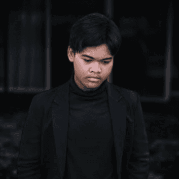
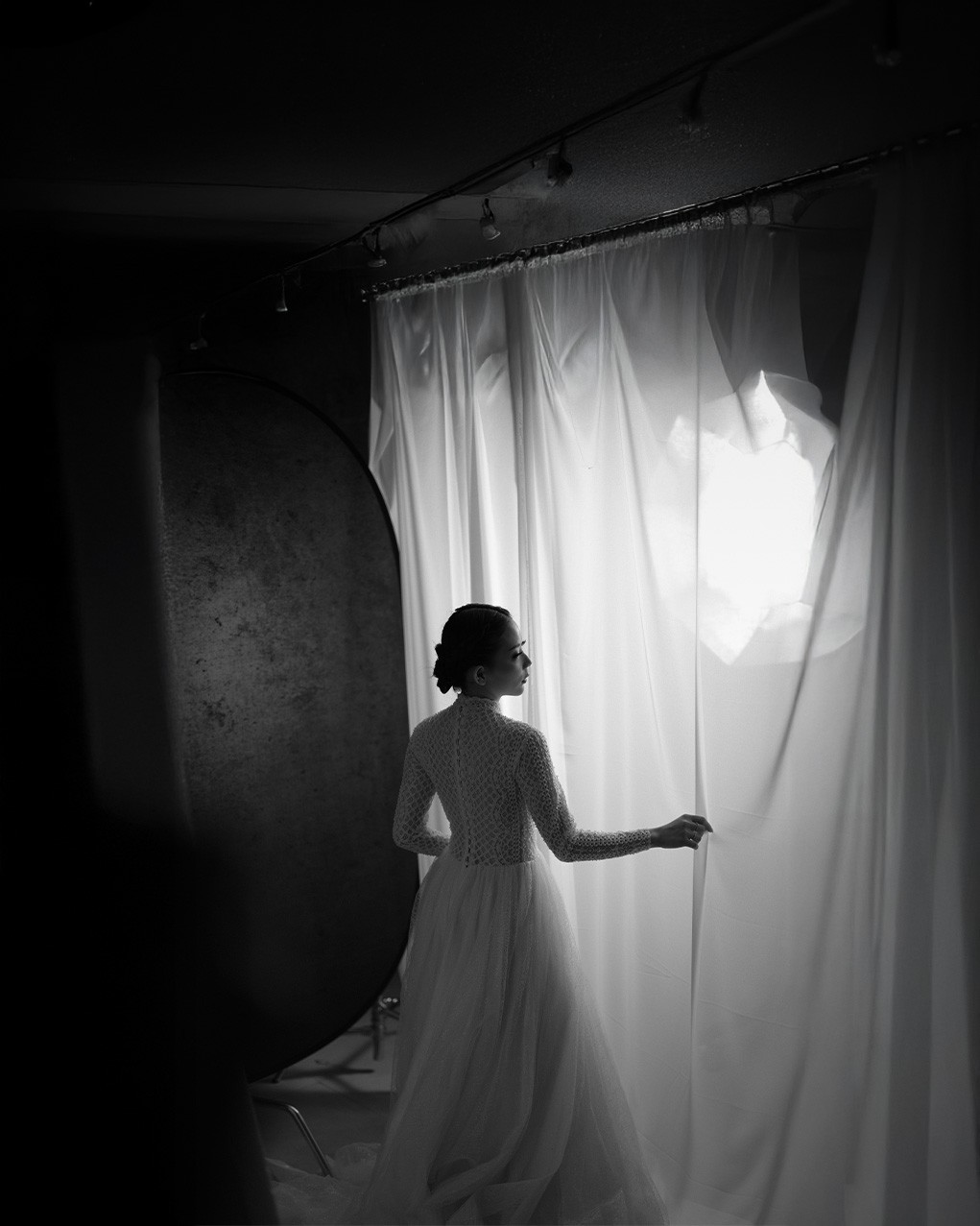
Color may catch the eye, but black and white captures the soul. In portrait photography, going monochrome can strip away distractions and bring the viewer closer to the subject's emotion, texture, and essence.
But how do you know when a shot should be black and white? And how do you get it right?
This article explores the power of monochrome portraits—when to use them, why they work, and how to create stunning black and white images with intention.
Why Choose Black and White?
1. Timelessness
Black and white portraits often feel classic and eternal. Without modern color trends or hues that date an image, your photo can live outside of time.
2. Emotional Focus
Removing color enhances:
Facial expressions
Eye contact
Mood and drama
Viewers focus more on feeling than color harmony.
3. Highlighting Contrast & Form
Monochrome emphasizes:
Light vs. shadow
Facial structure
Lines and shapes
This creates striking, sculptural portraits.
4. Reducing Distractions
Color can sometimes pull attention away from your subject. Black and white simplifies the scene, guiding the eye to what matters most.
When to Shoot (or Convert) in Black and White
Not every image works in monochrome. Here’s when going black and white can enhance your portrait:
✅ Ideal Conditions:
Strong lighting contrast (e.g., side lighting, rim light)
Textured surfaces (skin, fabric, hair)
Deep emotion or storytelling focus
Busy or colorful backgrounds you want to downplay
🚫 Avoid When:
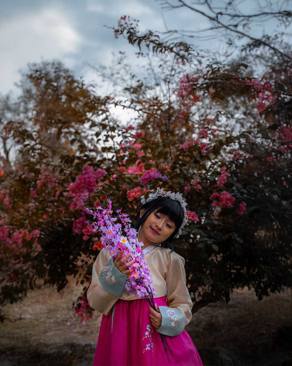
The photo relies on color symbolism (e.g., vibrant makeup, costumes)
There’s low tonal contrast and everything looks flat
You want to showcase fashion or environment through color
How to Shoot for Black and White
Even if you're shooting in color and converting later, plan your shot with monochrome in mind.
1. Think in Tones, Not Hues
Pay attention to:
Highlights and shadows
Midtones and gradients
Texture and light direction
Color contrast doesn't always translate to tonal contrast. For example, red and green look very similar in grayscale.
2. Use Dramatic Lighting
Lighting is crucial in black and white portraits.
Try Rembrandt lighting, split light, or hard shadows
Directional light reveals shape and emotion
Backlighting or low key setups can add impact
3. Expose Carefully
Slight underexposure works well to deepen shadows
Avoid blown highlights—you can’t recover them in black and white
Use zebra stripes or the histogram to guide your exposure
Post-Processing Tips for Stunning B&W Portraits
Start with a Color File
Shoot in RAW and color—you’ll have more flexibility converting in post.
Conversion Tools:
Adobe Lightroom
Photoshop (Black & White adjustment layer)
Capture One
Nik Silver Efex Pro (dedicated B&W plugin)
Key Editing Areas:
Contrast: Increase to define features
Clarity/Texture: Enhance fine details in skin and fabric
Blacks/Whites: Adjust carefully for punch without losing balance
Split Toning: Add subtle warmth or coolness to highlights and shadows for mood
Grain: Add film-style grain for a vintage or raw feel
Composition Tips for Monochrome Portraits
Without color to guide the viewer, composition plays a bigger role in holding attention.
Use negative space for minimalist impact
Tight crops can emphasize emotion and eyes
Leading lines help draw focus to the face
Symmetry and geometry can elevate simple compositions
Real-Life Examples
Situation | Why B&W Works |
|---|---|
Moody studio portrait | Emphasizes shadows and shape |
Elderly subject with textured skin | Highlights depth and life experience |
Street portrait with cluttered backgroud | Simplifies and isolates the subject |
Emotional close-up | Enhances raw feeling and eye contact |
Color vs. Black & White: A Side-by-Side Approach
When editing, compare color and black and white versions to see which:
Tells a stronger story
Evokes deeper emotion
Removes distraction
Has greater visual impact
📝 Not every image needs to go monochrome—but when it works, it really works.
Conclusion
Black and white portraits are not just colorless photos—they’re intentional artistic choices. They strip away the surface and draw out what’s real, raw, and human.
Whether you're chasing timeless beauty or storytelling drama, going monochrome can help you cut through the noise and capture the soul.
So next time you're behind the camera, ask:
“Would this portrait say more in black and white?”
If the answer is yes—embrace the shadows and let the emotion speak for itself.
Color may catch the eye, but black and white captures the soul. In portrait photography, going monochrome can strip away distractions and bring the viewer closer to the subject's emotion, texture, and essence.
But how do you know when a shot should be black and white? And how do you get it right?
This article explores the power of monochrome portraits—when to use them, why they work, and how to create stunning black and white images with intention.
Why Choose Black and White?
1. Timelessness
Black and white portraits often feel classic and eternal. Without modern color trends or hues that date an image, your photo can live outside of time.
2. Emotional Focus
Removing color enhances:
Facial expressions
Eye contact
Mood and drama
Viewers focus more on feeling than color harmony.
3. Highlighting Contrast & Form
Monochrome emphasizes:
Light vs. shadow
Facial structure
Lines and shapes
This creates striking, sculptural portraits.
4. Reducing Distractions
Color can sometimes pull attention away from your subject. Black and white simplifies the scene, guiding the eye to what matters most.
When to Shoot (or Convert) in Black and White
Not every image works in monochrome. Here’s when going black and white can enhance your portrait:
✅ Ideal Conditions:
Strong lighting contrast (e.g., side lighting, rim light)
Textured surfaces (skin, fabric, hair)
Deep emotion or storytelling focus
Busy or colorful backgrounds you want to downplay
🚫 Avoid When:
The photo relies on color symbolism (e.g., vibrant makeup, costumes)
There’s low tonal contrast and everything looks flat
You want to showcase fashion or environment through color
How to Shoot for Black and White
Even if you're shooting in color and converting later, plan your shot with monochrome in mind.
1. Think in Tones, Not Hues
Pay attention to:
Highlights and shadows
Midtones and gradients
Texture and light direction
Color contrast doesn't always translate to tonal contrast. For example, red and green look very similar in grayscale.
2. Use Dramatic Lighting
Lighting is crucial in black and white portraits.
Try Rembrandt lighting, split light, or hard shadows
Directional light reveals shape and emotion
Backlighting or low key setups can add impact
3. Expose Carefully
Slight underexposure works well to deepen shadows
Avoid blown highlights—you can’t recover them in black and white
Use zebra stripes or the histogram to guide your exposure
Post-Processing Tips for Stunning B&W Portraits
Start with a Color File
Shoot in RAW and color—you’ll have more flexibility converting in post.
Conversion Tools:
Adobe Lightroom
Photoshop (Black & White adjustment layer)
Capture One
Nik Silver Efex Pro (dedicated B&W plugin)
Key Editing Areas:
Contrast: Increase to define features
Clarity/Texture: Enhance fine details in skin and fabric
Blacks/Whites: Adjust carefully for punch without losing balance
Split Toning: Add subtle warmth or coolness to highlights and shadows for mood
Grain: Add film-style grain for a vintage or raw feel
Composition Tips for Monochrome Portraits
Without color to guide the viewer, composition plays a bigger role in holding attention.
Use negative space for minimalist impact
Tight crops can emphasize emotion and eyes
Leading lines help draw focus to the face
Symmetry and geometry can elevate simple compositions
Real-Life Examples
Situation | Why B&W Works |
|---|---|
Moody studio portrait | Emphasizes shadows and shape |
Elderly subject with textured skin | Highlights depth and life experience |
Street portrait with cluttered backgroud | Simplifies and isolates the subject |
Emotional close-up | Enhances raw feeling and eye contact |
Color vs. Black & White: A Side-by-Side Approach
When editing, compare color and black and white versions to see which:
Tells a stronger story
Evokes deeper emotion
Removes distraction
Has greater visual impact
📝 Not every image needs to go monochrome—but when it works, it really works.
Conclusion
Black and white portraits are not just colorless photos—they’re intentional artistic choices. They strip away the surface and draw out what’s real, raw, and human.
Whether you're chasing timeless beauty or storytelling drama, going monochrome can help you cut through the noise and capture the soul.
So next time you're behind the camera, ask:
“Would this portrait say more in black and white?”
If the answer is yes—embrace the shadows and let the emotion speak for itself.