More insights.

Subscribe to our newsletter.
Deep dives into design thinking, creative process, and the intersection of business and aesthetics.
Color isn’t just a backdrop—it’s a storytelling tool. In portrait photography, color can instantly set the tone, highlight emotion, and guide the viewer’s focus. When used with intention, color theory becomes one of your strongest creative weapons.
Whether you’re planning a stylized shoot or editing in post, this guide will help you harness the power of color to shape mood and emotion in every portrait you capture.
What Is Color Theory?
Color theory is a set of principles used to understand how colors interact and how they affect human emotions. In photography, this involves:
Choosing color palettes intentionally
Understanding complementary and contrasting colors
Using color to guide the viewer’s eye and emotional response
Think of it like visual psychology: different hues evoke different feelings.
The Emotional Impact of Color
Here's a quick breakdown of what common colors convey:
Color | Emotion/Mood | Example Use |
|---|---|---|
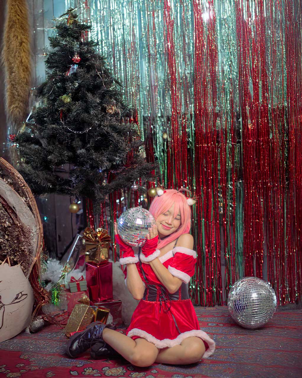
Red | Passion. energy, danger | Editorial shoots, dramatic fashion |
Blue | Calm, sadness, trust | Introspective portraits, serene environments |
Yellow | Joy, youth, warmth | Lifestyle or childhood portraits |
Green | Nature, balance, peace | Outdoor shoots, environmental portraiture |
Purple | Luxury, mystery, creativity | Conceptual fashion, fantasy themes |
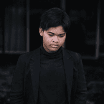
Black | Power, elegance, sorrow | Moody or formal portraits |
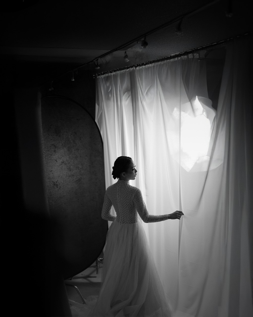
White | Purity, simplicity, clarity | Minimalist or bridal portraits |
📸 Use these associations to match your subject's story or intended vibe.
1. Use Color Harmony for Visual Balance
Color harmony is the combination of colors that are visually pleasing when used together. Use these principles to build cohesive, mood-driven portraits.
Common Color Harmonies:
Complementary (opposites on the color wheel, e.g., red & green)
Analogous (next to each other, e.g., blue, teal, green)
Monochromatic (one color in different shades)
Triadic (three evenly spaced hues, e.g., red, yellow, blue)
🎯 Example: A red dress against a green forest background (complementary) creates bold contrast and tension.
2. Set the Mood Through Background Color
Your backdrop has a powerful influence on the emotional tone of the portrait.
Mood Examples:
Dark greys or blues = introspective, moody
Warm earth tones = cozy, grounded
Bright pastels = light, playful, youthful
🧱 Use painted backdrops, fabric, colored paper, or real environments that align with your color story.
3. Wardrobe Styling with Color Theory
Clothing is a critical element of your color palette. It’s one of the most direct ways to influence the mood of your portrait.
Tips:
Match wardrobe to complement or contrast the background
Use bold colors for editorial or fashion shots
Keep it neutral if focusing on facial expression or emotion
🧥 Example: A white dress in a desert landscape feels pure and ethereal; the same dress in a gritty urban alley feels stark and jarring.
4. Lighting and Color Temperature
Light doesn’t just brighten your subject—it also affects color and emotion.
Color Temperature Basics:
Cool light (blue tones) = modern, melancholy, calm
Warm light (orange/red tones) = inviting, romantic, nostalgic
Use gels or white balance adjustments to shift the temperature to fit your creative vision.
💡 A warm-toned golden hour portrait feels romantic; a cool-toned studio light setup can feel futuristic or distant.
5. Props and Color Accents
Small touches of color can subtly influence mood without dominating the image.
Examples:
A red flower held in a black-and-white setting = passion or isolation
A yellow chair in a neutral room = optimism, focus
A blue umbrella on a rainy day = melancholy, mood
🎯 Use these to add narrative layers to your portrait without cluttering the frame.
6. Post-Processing with Color Grading
Color grading in Lightroom, Photoshop, or Capture One lets you refine the emotional tone of your image.
Color Grading Tools:
Hue/Saturation for target adjustments
Split toning for highlights and shadows
Color calibration for overall color mood
Curves & LUTs for cinematic feels
🎨 Shift cooler for drama, warmer for connection—or experiment to find your unique color signature.
7. Use a Mood Board to Plan Your Palette
Before a shoot, gather visual references that match the color mood you’re going for. Use tools like:
Pinterest
Adobe Color Wheel
Milanote
Pantone Studio
Plan everything from location and wardrobe to props and lighting using a cohesive palette.
📝 This ensures visual consistency across a shoot or entire portfolio.
8. Real-Life Examples of Color-Driven Portraits
Scenario | Color Palette | Mood Achieved |
|---|---|---|
Urban fashion shoot | Red, black, concrete gray | Edgy, confident |
Beach lifestyle shoot | Sandy beige, ocean blue, white | Calm, natural |
Indoor editorial | Gold, emerald green, shadow | Luxurious, mysterious |
Teen portrait | Pastel pink, soft blue, white | Playful, fresh |
Take note of these combinations and use them as templates for your own projects.
Conclusion
Color theory is more than just an art school concept—it’s a powerful language in your portrait photography toolkit. By learning how colors influence mood, you can craft portraits that don’t just look beautiful—they feel meaningful.
The next time you plan a shoot, ask yourself:
What do I want the viewer to feel?
Then, let color guide the answer.
Color isn’t just a backdrop—it’s a storytelling tool. In portrait photography, color can instantly set the tone, highlight emotion, and guide the viewer’s focus. When used with intention, color theory becomes one of your strongest creative weapons.
Whether you’re planning a stylized shoot or editing in post, this guide will help you harness the power of color to shape mood and emotion in every portrait you capture.
What Is Color Theory?
Color theory is a set of principles used to understand how colors interact and how they affect human emotions. In photography, this involves:
Choosing color palettes intentionally
Understanding complementary and contrasting colors
Using color to guide the viewer’s eye and emotional response
Think of it like visual psychology: different hues evoke different feelings.
The Emotional Impact of Color
Here's a quick breakdown of what common colors convey:
Color | Emotion/Mood | Example Use |
|---|---|---|
Red | Passion. energy, danger | Editorial shoots, dramatic fashion |
Blue | Calm, sadness, trust | Introspective portraits, serene environments |
Yellow | Joy, youth, warmth | Lifestyle or childhood portraits |
Green | Nature, balance, peace | Outdoor shoots, environmental portraiture |
Purple | Luxury, mystery, creativity | Conceptual fashion, fantasy themes |
Black | Power, elegance, sorrow | Moody or formal portraits |
White | Purity, simplicity, clarity | Minimalist or bridal portraits |
📸 Use these associations to match your subject's story or intended vibe.
1. Use Color Harmony for Visual Balance
Color harmony is the combination of colors that are visually pleasing when used together. Use these principles to build cohesive, mood-driven portraits.
Common Color Harmonies:
Complementary (opposites on the color wheel, e.g., red & green)
Analogous (next to each other, e.g., blue, teal, green)
Monochromatic (one color in different shades)
Triadic (three evenly spaced hues, e.g., red, yellow, blue)
🎯 Example: A red dress against a green forest background (complementary) creates bold contrast and tension.
2. Set the Mood Through Background Color
Your backdrop has a powerful influence on the emotional tone of the portrait.
Mood Examples:
Dark greys or blues = introspective, moody
Warm earth tones = cozy, grounded
Bright pastels = light, playful, youthful
🧱 Use painted backdrops, fabric, colored paper, or real environments that align with your color story.
3. Wardrobe Styling with Color Theory
Clothing is a critical element of your color palette. It’s one of the most direct ways to influence the mood of your portrait.
Tips:
Match wardrobe to complement or contrast the background
Use bold colors for editorial or fashion shots
Keep it neutral if focusing on facial expression or emotion
🧥 Example: A white dress in a desert landscape feels pure and ethereal; the same dress in a gritty urban alley feels stark and jarring.
4. Lighting and Color Temperature
Light doesn’t just brighten your subject—it also affects color and emotion.
Color Temperature Basics:
Cool light (blue tones) = modern, melancholy, calm
Warm light (orange/red tones) = inviting, romantic, nostalgic
Use gels or white balance adjustments to shift the temperature to fit your creative vision.
💡 A warm-toned golden hour portrait feels romantic; a cool-toned studio light setup can feel futuristic or distant.
5. Props and Color Accents
Small touches of color can subtly influence mood without dominating the image.
Examples:
A red flower held in a black-and-white setting = passion or isolation
A yellow chair in a neutral room = optimism, focus
A blue umbrella on a rainy day = melancholy, mood
🎯 Use these to add narrative layers to your portrait without cluttering the frame.
6. Post-Processing with Color Grading
Color grading in Lightroom, Photoshop, or Capture One lets you refine the emotional tone of your image.
Color Grading Tools:
Hue/Saturation for target adjustments
Split toning for highlights and shadows
Color calibration for overall color mood
Curves & LUTs for cinematic feels
🎨 Shift cooler for drama, warmer for connection—or experiment to find your unique color signature.
7. Use a Mood Board to Plan Your Palette
Before a shoot, gather visual references that match the color mood you’re going for. Use tools like:
Pinterest
Adobe Color Wheel
Milanote
Pantone Studio
Plan everything from location and wardrobe to props and lighting using a cohesive palette.
📝 This ensures visual consistency across a shoot or entire portfolio.
8. Real-Life Examples of Color-Driven Portraits
Scenario | Color Palette | Mood Achieved |
|---|---|---|
Urban fashion shoot | Red, black, concrete gray | Edgy, confident |
Beach lifestyle shoot | Sandy beige, ocean blue, white | Calm, natural |
Indoor editorial | Gold, emerald green, shadow | Luxurious, mysterious |
Teen portrait | Pastel pink, soft blue, white | Playful, fresh |
Take note of these combinations and use them as templates for your own projects.
Conclusion
Color theory is more than just an art school concept—it’s a powerful language in your portrait photography toolkit. By learning how colors influence mood, you can craft portraits that don’t just look beautiful—they feel meaningful.
The next time you plan a shoot, ask yourself:
What do I want the viewer to feel?
Then, let color guide the answer.